
Making content
Freely create unique content without restrictions. Combine a wide array of design elements provided in VXT Canvas, which include templates, widgets, patterns, and art, to achieve the desired styles and layouts. Create unique content with ease by freely editing the positions, sizes, and colors of elements. Arrange and decorate as you see fit. Let your creativity take shape using the intuitive editing tools.
Creating Content Using Templates
VXT Canvas provides a wide range of templates enabling users to create expert-quality content with ease.
 |
-
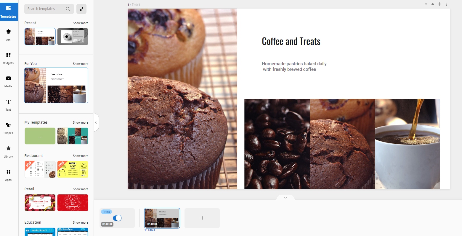
On the main page of the Content menu, click Create Content to open a blank page. A blank, untitled canvas with a white background is displayed.
-
Enter a name to specify the canvas name.
-
From the main panel on the canvas page, click Templates and then select a template.
-
The selected template appears on the Canvas page.
-
Add text or media elements to the template.
-
From the element properties panel on the right, fine-tune the properties to achieve the desired content.
Available categories of templates
The following items are displayed when the Template menu is selected.
|
Item |
Description |
|---|---|
|
Search Templates |
Enter a search term to search for specific templates. |
|
Recent |
Displays a list of recently used templates. |
|
For you |
Displays a list of templates recommended for your business type. |
|
Restaurant |
Displays a list of templates for creating restaurant-related content. |
|
QSR |
Displays a list of templates for creating fast food content. |
|
Retail |
Displays retail business-related templates. |
|
Education |
Displays a list of templates for creating educational content. |
|
Health care |
Displays a list of templates for creating health and medical content. |
|
Grid |
Displays a list of templates for organizing a page by dividing it into sections. |
|
Allocation |
Displays all available templates. |
Editing Specific Template Settings Using the Properties Menu
Freely adjust the background, color, size, sound, and style for a template added to a canvas. With just a few simple edits, you can transform your content into engaging and eye-catching content.
 |
-
Select the design element you want to edit from VXT Canvas. Editable items are displayed in the element properties panel on the right.
-
Select the image you want to edit, and then edit as desired by configuring settings in the element properties panel. Images, texts, background theme, and other items can be individually edited.
-
To move an element, click the element and drag it to the desired position.
-
To resize an element, click one corner of the element and drag up/down or left/right.
-
To rotate an element, select the element and drag the rotation axis in the desired direction.
Background properties
Adjust properties of background elements. Click the BG tab.
|
Item |
Description |
|---|---|
|
Background Color |
Set the background color. |
|
Background Sound |
Set the background music. |
|
Page to Go |
Select the page to go to.
|
Canvas properties
Adjust the properties of canvas elements. Click the Canvas tab.
|
Item |
Description |
|---|---|
|
Size |
Set the Canvas size.
|
|
Orientation |
Set the Canvas orientation.
|
|
Background Sound to Play |
Select the page on which background sounds will play. |
Style properties
To change the font, background color, or styles, click the Style tab. Displayed editable style items differ from element to element.
Text Style
The following text style properties can be edited when a text element is clicked.
|
Item |
Description |
|---|---|
|
Upload Font |
Upload the font file to use. |
|
Font / Font Size |
Set the font and font size. |
|
Text Color |
Set the text color. |
|
Background |
Set the background color. |
|
Text Outline |
Configure border settings. |
|
Text Shadow |
Configure shadow settings. |
|
Align Text |
Set the alignment.
|
|
Text Style |
Set the text style.
|
|
Text spacing |
Set the line spacing and character spacing.
|
|
Auto Fit |
Automatically adjust text alignment, style and spacing. |
|
Animation |
Set animation effects.
|
|
Shadow |
Configure shadow settings.
|
|
Border |
Configure border settings.
|


Image style
The following style properties can be edited when an image element is clicked.
|
Item |
Description |
|---|---|
|
Remove Background |
Delete the image background.
|
|
Crop |
Crop an element. |
|
Filter |
Set filter effects to add to an image.
|
|
Adjust |
Configure image color settings.
|
|
Shadow |
Configure shadow settings.
|
|
Border |
Configure border settings.
|
Alignment properties
Configure settings to align or rearrange image or text elements. Click the Arrange tab.
|
Item |
Description |
|---|---|
|
Align |
Set the element alignment.
|
|
Arrange |
Rearrange the element.
|
|
Rotate |
Rotate the element.
|
|
Position & Size |
Set an element position and size.
|
 Group |
Select and group several elements. This option is available for elements that are not grouped. |
 Ungroup |
Ungroup elements. This option is available for elements that are grouped. |
 Duplicate |
Copy and paste elements. |
 Delete |
Delete the selected element(s). |
 Lock |
Lock the selected element(s). You cannot edit any style or arrangement properties for the element(s). |
 Unlock |
Unlock elements. You can edit any style or arrangement properties for the elements. |
 Animation |
Set animation effects. |
 Add Touch Event |
Set a page to redirect to when an element is touched during playback.
|


-
To copy the selected element, select Arrange in the Duplicate tab.
-
To delete the selected element, select Arrange in the Delete tab.
Animation properties
Insert specific animation effects into elements, or adjust the settings of elements that have animation effects. Click the Animation tab.
|
Item |
Description |
|---|---|
|
Ineffect |
Configure appear-effect settings.
|
|
Highlight Effect |
Configure highlight-effect settings.
|
|
Out Effect |
Configure close-effect settings.
|
|
Animated Items |
Displays a list of configured animated items. If you click Preview All, you can preview all animated items. |
-
To preview an inserted animation effect, click Preview from the Content menu.
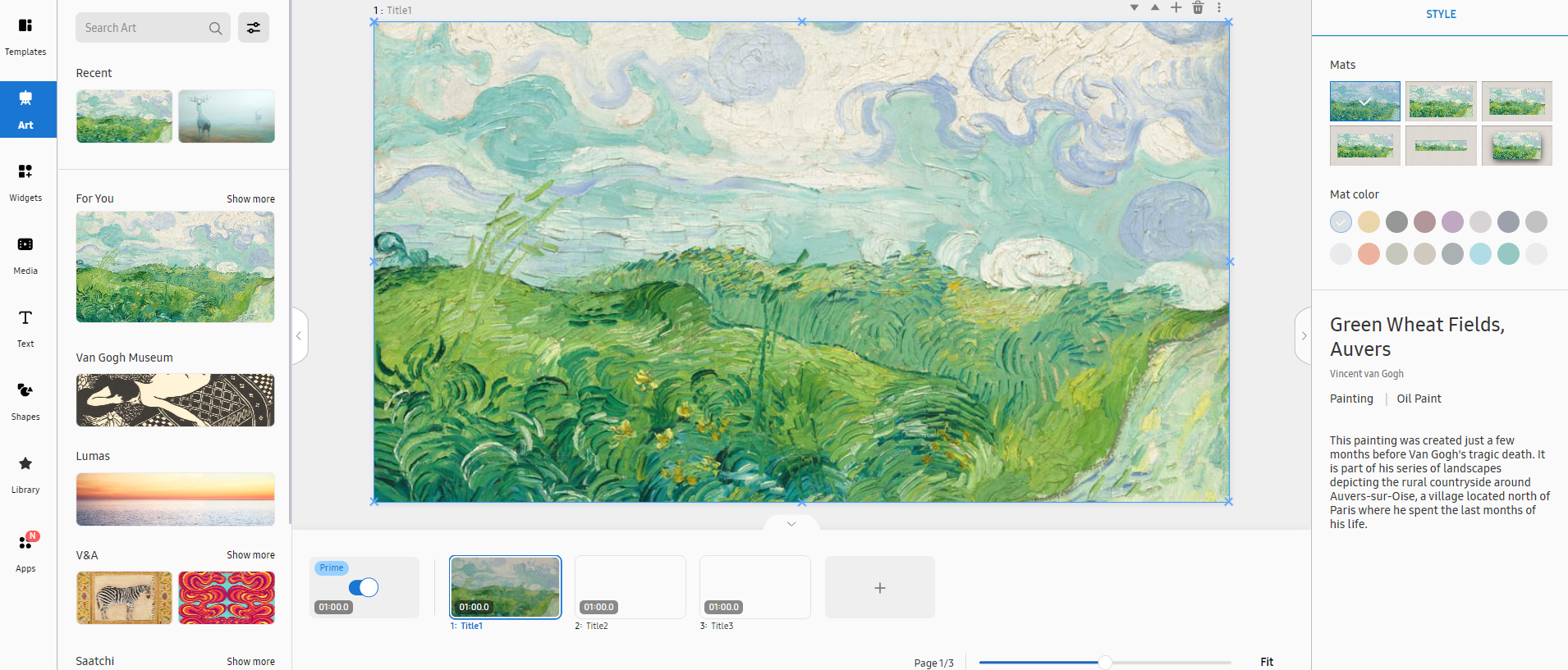
Creating Content Using Art Elements
VXT Canvas offers paintings, photos, and other art elements.
You cannot add or overlap another element on top of art elements, as they are copyrighted
works.
 |
-
Open the main page of the Content menu.
-
From the main panel on the canvas page, select Art.
-
From the list of art elements, select the art you want to add. The canvas displays the selected art.
-
From the element properties panel on the right, fine-tune the properties to achieve the desired content. For more information about element properties, refer to the following:
Art items
The following items are displayed when the Art menu is selected.
|
Item |
Description |
|---|---|
|
Search templates |
Search with a keyword to easily find specific art content. |
|
Recent |
Displays recently used art content. |
|
For you |
Displays recommended art content. |
Editing art using the properties menu
Edit the styles of the art element you have added to a canvas. This can be done from the element properties panel on the right of the canvas.
 |
|
Item |
Description |
|---|---|
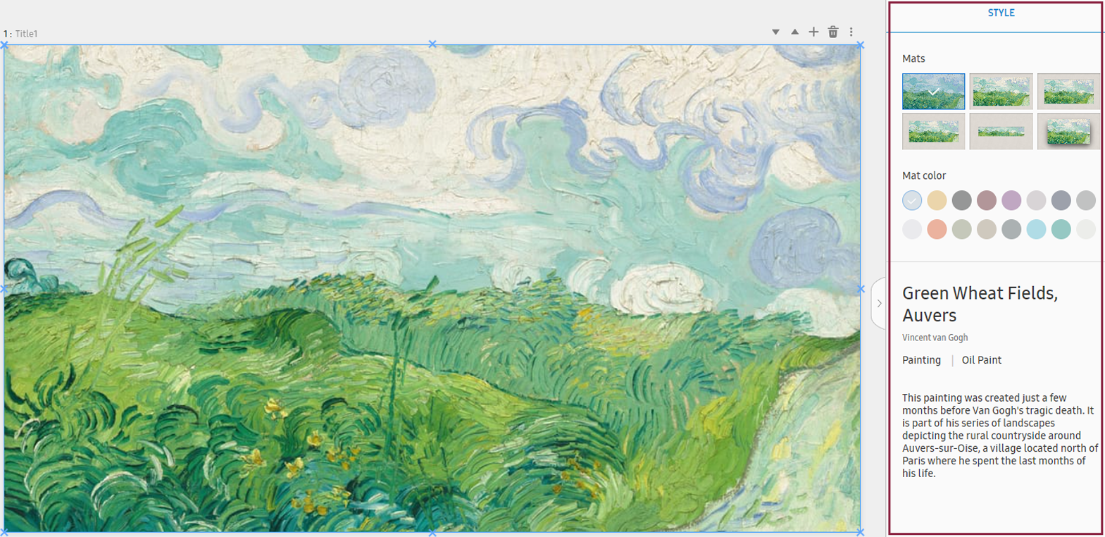
|
Mats |
Suggests stylish art frame layouts. Select the desired layout to automatically align the art element to the frame or clip the element to highlight only a portion of it. |
|
Mat color |
Edit the art frame color. |
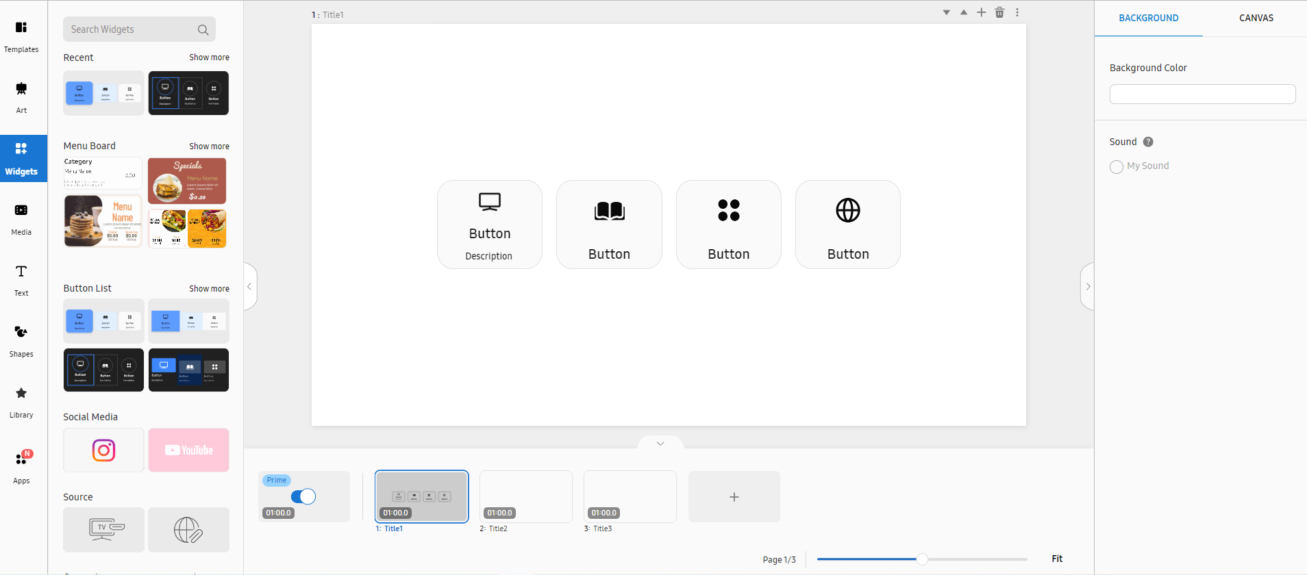
Creating Content Using Widget Elements
VXT CMS offers a wide variety of widgets, including menu boards, weather information, clocks, and button lists. Add visual effects, such as rotating objects, flying confetti, and radial waves to suit your needs.
-
When displaying a website using a web widget, the VXT Player plays the website by inserting it in an iframe format. If the URL is not played properly, confirm that it is a URL that can be played in an iframe format.
-
For more information about iframe, refer to the following:
https://developer.mozilla.org/en-US/docs/Web/HTML/Element/iframe
 |
-
Open the main page of the Content menu.
-
From the main panel on the canvas page, select Widgets.
-
From the list of widget elements, select the desired widget to display it on the canvas. For the range of widgets available in VXT CMS, refer to the following:
-
From the element properties panel on the right, fine-tune the properties to achieve the desired content.
Widgets Menu
The following items are displayed when the Widgets menu is selected.
|
Item |
Description |
|---|---|
|
Search widgets |
Search with a keyword to easily find specific widgets. |
|
Recent |
Displays recently used widgets. |
|
Menu Board |
This is the menu board widget. |
|
Button List |
This is the button list widget. |
|
Others |
Displays all available widgets other than the menu board widgets. |
Using Different Types of Widgets
Add various widgets, offered by VXT, to your content. This organically connects the content to functions to expand functionality, allowing you to use the functions more easily.
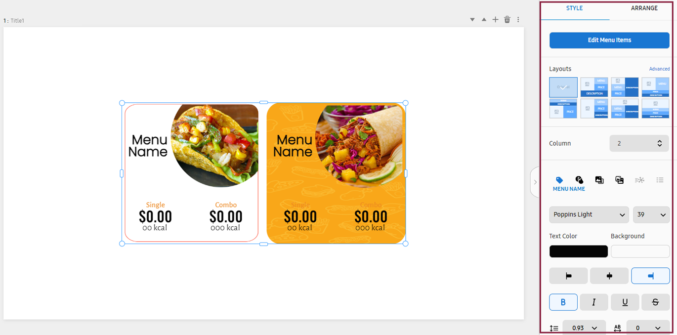
Using menu board widgets
Select a menu board widget and customize it to suit your preferences.
-
From the main panel on the canvas page, click Widgets > Menu Board and then select the menu board widget you want.
If the intended menu board widget is not found on the list, click Show more to browse more widgets.
-
The selected widget appears on the Canvas.
-
In the element properties panel, adjust the properties of elements included in the widget, such as images, texts, and/or layouts, to achieve the desired content. For more information about element properties, refer to the following:
Editing a menu board widget using the properties menu
Edit the styles of a menu board widget added to a canvas. This can be done from the element properties panel on the right of the canvas.
 |
Background properties
Adjust properties of background elements. Click the BG tab.
For more information about background properties, refer to the following:
Canvas properties
Adjust the properties of canvas elements. Click the Canvas tab.
For more information about canvas properties, refer to the following:
Style properties
Adjust style properties of a menu board. Click the Style tab.
|
Item |
Description |
|---|---|
|
Edit Menu Items |
Displays the widget-item editor window. |
|
Layout |
Change the widget layout.
|
|
Column |
Set the number of widgets to arrange in one row. |
 (Menu Name) |
Configure the menu name display settings. |
 (Price & Calories) |
Set the price and calories. |
 (Menu Item Image) |
Set a menu item image. |
 (Background Image) |
Set the background image. |
 (Description & Allergies) |
Enter a menu description, and set information regarding ingredients that may cause allergies. |
 (Category) |
Configure menu category-related settings. |
|
Font / Font Size |
Set the font and font size. |
|
Text Color |
Set the text color. |
|
Background |
Set the background color. |
|
Arrange |
Set the alignment.
|
|
Text Style |
Set the text style.
|
|
Distance |
Set the line spacing and character spacing.
|
Alignment properties
Configure settings to align or rearrange image or text elements. Click the Arrange tab.
For more information about alignment properties, refer to the following:
Editing menu board widget items
Edit the images and descriptions of food/beverage items shown on a menu board, as well as the menu board background. In the Style tab, click Edit Menu Items. A pop-up window appears where you can edit menu items.
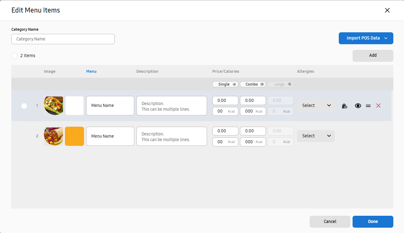 |
|
Item |
Description |
|---|---|
|
Category Name |
Set the name of a menu board. |
|
Import POS data |
Load POS data to design a digital menu board with ease. Click to select and install a desired POS app. |
|
Add |
Add a new food/beverage item. |
|
Image |
Shows the image of a food/beverage item. To edit a food/beverage item image, click on the image to load different image content.
|
|
MENU |
Set the name of a food/beverage item. The menu name field cannot be left blank. |
|
Description |
Enter a description of the menu. |
|
Price/Calories |
Enter the price and calories of the menu. |
|
Allergies |
Displays ingredients that may cause allergies. |
Hover the mouse cursor over a menu item to display the following icons.
-
 (Sold out: On:Sold out: On): Change the status of a food/beverage item to sold out.
 -
 (Hide): Hide a food/beverage item.
 -
 (Move): Drag and drop to rearrange a food/beverage item.
 -
 (Delete): Delete a food/beverage item.
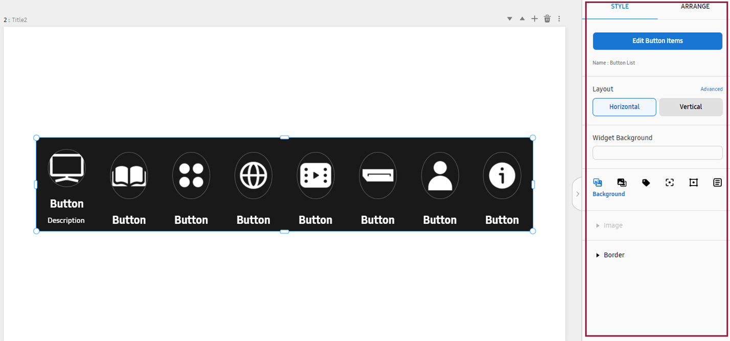
Using button list widgets
Configure button-associated actions using a button list widget.
-
From the main panel on the canvas page, click Widgets > Button List and then select the button list you want.
If the intended button list widget is not found, click Show more to browse more widgets.
-
The selected widget appears on the Canvas.
-
Edit button items, button list name, and background image by adjusting the properties of elements, to achieve the desired content.
Setting actions to trigger when a button is clicked
Configure functions to trigger when a button is clicked, as follows:
-
Select a button list and then click Edit Button Items in the element properties panel on the right.
-
Configure the Click to Action settings for the intended button item.
-
Select Move page: Redirects to the specified page when a specific button is clicked.
-
Change Language: Changes to the specified language when a specific button is clicked.
-
-
Click Done to save the changes.
To set actions to trigger when a button is focused on using the remote control or by touching the button, configure the Focus to Action settings.
Editing a button list widget using the properties menu
Edit the styles of a button list widget added to a canvas. This can be done from the element properties panel on the right of the canvas.
 |
Background properties
Adjust properties of background elements. Click the BACKGROUND tab.
For more information about background properties, refer to the following:
Canvas properties
Adjust the properties of canvas elements. Click the Canvas tab.
For more information about canvas properties, refer to the following:
Style properties
Adjust style properties of a button list widget. Click the Style tab.
|
Item |
Description |
|---|---|
|
Button List Name |
Set the name of a button list. |
|
Edit Button Items |
Edit the widget buttons. |
|
Layout |
Set the widget layout to horizontal or vertical. To fine-tune the item spacing or the size of a section within an item, click Advanced. |
|
Widget Background |
Edit the background color of the widget. |
|
|
Change the background image. Adjust the color of the outlines that separate individual widgets. |
|
|
Edit the image of a button, or edit the background color, position, and size of a button image. |
|
|
Change the font type, color, and size of a button name. |
|
|
Set how colors will change when a button is touched with the mouse or hand. |
|
|
Set how colors will change when a button is selected. |
|
|
Display or hide the description of a button. Edit the font type, color, and size of the displayed description. |


Editing button list settings
Edit the image and background of a button list, as well as the actions to trigger when a button is clicked. In the Style tab, click Edit Button Items. The edit-button window appears.
-
When an added language is in use, a button list appears, comprised of the same items as the items for the default language. Items other than button names or descriptions can be added, edited or deleted.
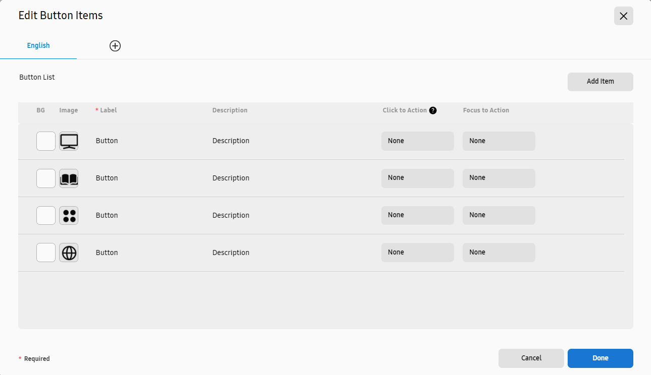 |
|
Item |
Description |
|---|---|
|
English |
Items are displayed in the language set in VXT CMS. |
|
Add Item |
Add buttons. |
|
BG |
Set the background color for a button. |
|
Image |
Set the icon image for a button. |
|
Label |
Enter a button name. |
|
Description |
Enter a description of a button. |
|
Click to Action |
Set the action to perform when a button is clicked.
|
|
Focus to Action |
Set the action to perform when a button is focused. |

Hover the mouse cursor over a menu item to display the following icons.
-
(Hide): Hides the button.
-
(Move): Drag and drop to rearrange a food/beverage item.
-
(Delete): Delete a food/beverage item.
Alignment properties
Configure settings to align or rearrange image or text elements. Click the Arrange tab.
For more information about alignment properties, refer to the following:
Using social media widgets
VXT CMS supports an Instagram business widget.
For details on how to set and use an Instagram business widget, refer to the following:
Using external input widgets
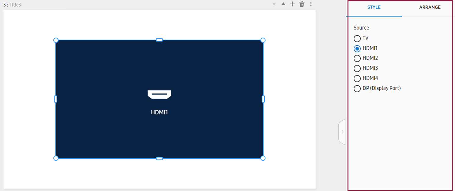
VXT Canvas can display the content playing on a connected external device or on a website.
-
If you publish web elements containing streaming media together with other media elements, they may not play properly on the screens. Add only one external input widget per page.
Connecting an external input source
-
From the main panel on the canvas page, select Widgets > SOURCE >
 (TV/HDMI). The selected widget is displayed on the canvas.
-
Only one external input source can be added per page.
-
For some products, the HDMI output may not be displayed when the screen orientation is set to vertical. Please check the product’s release year and model.
-
-
Select an external input source from the element properties panel on the right.
-
Adjust the size of the external input widget, displayed on the canvas, by dragging with the mouse cursor. External device content is displayed at the size of the widget displayed on the canvas.
-
Click Preview to check that the content playing on the external input source is displayed properly.
Connecting a Website
-
From the main panel on the canvas page, select Widgets > SOURCE >
 (Web). The selected widget is displayed on the canvas.
 -
In the element properties panel on the right, enter the address of the website from which you want to import content for playback. Make sure the address includes “http://” or “https://.”
-
Adjust the size of the external input widget, displayed on the canvas, by dragging with the mouse cursor. External device content is displayed at the size of the widget displayed on the canvas.
-
Click Preview to check that the specified web content is displayed properly.
Editing a widget using the properties menu
Edit the styles of a button list widget added to a canvas. This can be done from the element properties panel on the right of the canvas.
 |
Background properties
Adjust properties of background elements. Click the BACKGROUND tab.
For more information about background properties, refer to the following:
Canvas properties
Adjust the properties of canvas elements. Click the Canvas tab.
For more information about canvas properties, refer to the following:
Style properties
Adjust style properties. Click the Style tab.
|
Item |
Description |
|---|---|
|
Source |
Select an external input source. |
|
Address |
Enter the website address to be displayed on the canvas. Make sure the address starts with “http://” or “https://.” |
|
Refresh Interval |
Set the website refresh interval. |
Alignment properties
Configure settings to align or rearrange image or text elements. Click the Arrange tab.
For more information about alignment properties, refer to the following:
Animation properties
Insert specific animation effects into elements, or adjust the settings of elements
that have animation effects. Click the Animation tab.
For more information about animation properties, refer to the following:
Using Utilities widgets
Ticker
Ticker displays scrolling text at the top of bottom of a screen. This is a useful feature for providing real-time information, such as news headlines, stock information, and announcements.
-
From the main panel on the canvas page, select Widgets > Utilities >
 (Ticker).
 -
The Add text option appears on the canvas.
-
In the element properties panel on the right, enter a ticker message in the message field.
-
Adjust animation effects, text color, and other element properties to customize the ticker styles.
-
Adjust the position of the ticker, displayed on the canvas, by dragging with the mouse.
RSS
This widget receives and displays the headlines and content of news articles, provided by external RSS feeds, on screens, in real time.
-
From the main panel on the canvas page, select Widgets > Utilities >
 (RSS).
 -
News headlines and content are displayed on the canvas.
-
To switch to a specific RSS feed, select an RSS feed item for news sites from the element properties panel on the right.
-
Adjust the feed count, refresh interval, animation effects, and other element properties to customize the RSS feed styles.
-
Adjust the sizes and positions of the RSS feeds, displayed on the canvas, by dragging with the mouse cursor.
QR
Using the QR code widget, create QR codes providing access to digital resources or information, such as website addresses, app links, or coupon information, and display them on screens. Users can scan a QR code with their smartphone to instantly access the linked content.
-
From the main panel on the canvas page, select Widgets > Utilities >
 (QR Generator).
-
If Utilities is not found uner QR Generator, click Show more on the right.
-
-
The QR code appears on the canvas.
-
In the element properties panel on the right, select a QR Type from the Style tab.
-
Select an item from among the Input Type items, and then enter the desired text, location information, and URL.
-
Adjust the QR code's color, size, animation effects, and other element properties to customize the QR code styles.
Countdown
Displays the number of hours remaining until a specified date and time.
-
From the main panel on the canvas page, select Widgets > Utilities >
 (Countdown).
-
If Utilities is not found under Countdown, click Show more on the right.
-
-
The countdown widget appears on the canvas.
-
In the element properties panel on the right, click the Style tab, enter a title under Title, and then enter a description of the countdown under Description.
-
Adjust the countdown text color, alignment, animation effects, and other element properties to customize the countdown widget styles.
Stock
Displays stock market updates.
-
From the main panel on the canvas page, select Widgets > Utilities >
 (Stock).
-
If Utilities is not found under Stock, click Show more on the right.
-
-
The exchange rate widget appears on the canvas.
-
In the element properties panel on the right, click the Style tab, select the stock markets for which you want to display information, and then set a transition effect.
-
Adjust the element properties to customize the exchange rate widget styles.
Currency
Displays up-to-date exchange rates.
-
From the main panel on the canvas page, select Widgets > Utilities >
 (Currency).
-
If Utilities is not found under Currency, click Show more on the right.
-
-
The exchange rate widget appears on the canvas, providing up-to-date exchange rate information.
-
In the element properties panel on the right, click the Style tab, set the Base Currency and Target Currency values, and then adjust element properties to customize the stock widget styles.
Editing a utilities widget using the properties menu
Edit the styles of a utilities widget added to a canvas. This can be done from the element properties panel on the right of the canvas.
 |
Background properties
Adjust properties of background elements. Click the BACKGROUND tab.
For more information about background properties, refer to the following:
Canvas properties
Adjust the properties of canvas elements. Click the Canvas tab.
For more information about canvas properties, refer to the following:
Style properties
Adjust style properties. Click the Style tab.
-
Ticker display style properties
|
Item |
Description |
|---|---|
|
Message |
Enter a ticker message. |
|
Animation |
Set the direction in which the ticker message scrolls. |
|
Speed |
Set the speed at which the ticker message scrolls. |
|
Text Color / Background |
Set the text color and background color of the ticker message. |
|
Text Outline |
Set the text outline and thickness for ticker messages. |
|
Text Shadow |
Set the shadow color, thickness, and spacing of text for ticker messages. |
|
Shadow |
Set the shadow color, size, and spacing for ticker background. |
|
Border |
Set the outline thickness and corner radius values for ticker background. |
-
RSS feed style properties
|
Item |
Description |
|---|---|
|
Layout |
Change the layout for RSS feeds. |
|
New Site RSS |
Select the news sites from which you want to receive information. |
|
Number of Feeds |
Set the total number of feeds for receiving information. |
|
Feed to Display |
Set the number of feeds to be displayed on a single page. |
|
Refresh Interval |
Set the cycle for receiving new information. |
|
Orientation |
Set the direction in which feeds are displayed. |
|
Animation |
Set visual effects that will appear when feeds are displayed. |
|
Scroll Interval |
Set the interval after which the next feeds will be displayed. |
|
Background |
Set the background color and theme for displayed RSS feeds. |
|
Title |
Set the font type, color, and size for feed titles. |
|
Description |
Set the font type, color, and size for feed descriptions. |
-
QR code style properties
|
Item |
Description |
|---|---|
|
Layout |
Change the layout for displaying a QR code. |
|
QR Type |
Select the type of QR code to be displayed. |
|
Input Type |
Select the information type for which you want to generate a QR code. Input settings differ by information type. |
|
Logo |
Set the logo image to be displayed in the middle of the QR code. |
|
QR Size |
Set the QR code size. |
|
QR Color |
Set the QR code’s data pattern color and background color. |
|
Background |
Set the QR code widget fill color. |
|
Title |
Enter and display a QR code title. |
|
Description |
Enter and display a QR code description. |
|
Shadow |
Add a shadow to the QR code background. |
|
Border |
Set the outline thickness and corner radius for the QR code background. |
-
Countdown display style properties
|
Item |
Description |
|---|---|
|
Layout |
Change the layout for displaying a countdown. |
|
Countdown |
Set the font type, color, and size for the countdown numbers, and set the countdown background image. |
|
Time |
Set the font type, color, and size for the non-numerical countdown items (e.g., date, hours, minutes, and seconds). |
|
Title |
Enter and display the title. |
|
Description |
Enter and display a description. |
|
Shadow |
Add a shadow to the background. |
|
Border |
Set the outline thickness and corner radius for the background. |
-
Stock index display style properties
|
Item |
Description |
|---|---|
|
Market Indices |
Select the stock indices to display and set a transition effect. |
|
Index Name |
Set the font type, color, and size for the stock index names. |
|
Final Closing Price |
Set the font type, color, and size for the final closing price of each stock. |
|
Change % |
Set a color code to rising stocks and falling stocks. Set the font type, color, and size for each item. |
|
Last Updated |
Set the font type, size, and color for last updated items. |
|
Background |
Set the background color. |
|
Shadow |
Add a shadow to the background. |
|
Border |
Set the outline thickness and corner radius for the background. |
-
Exchange rate display style properties
|
Item |
Description |
|---|---|
|
Base Currency |
Set the base currency. |
|
Target Currency |
Set the target currency against the base currency. |
|
Transition Effect |
Display the target currencies one by one with a transition effect, or display all of the target currencies simultaneously. |
|
Transition Interval |
To display the target currencies one by one, select the interval at which the transition effect will be displayed. |
|
Currency Identifier |
Set the font and color for the currency identifiers, flag types, and currency codes. |
|
Exchange Rate |
Set the exchange rate for the target currency, and set the font type, color, and size for each item. |
|
Last Updated |
Set the font type, size, and color for last updated items. |
|
Background |
Set the background color. |
|
Shadow |
Add a shadow to the background. |
|
Border |
Set the outline thickness and corner radius for the background. |
-
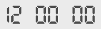
Calendar style properties
|
Item |
Description |
|---|---|
|
Font |
Set the font for displaying the calendar. |
|
Size |
Select a calendar size. |
|
Display Language |
Select a language for displaying the calendar. |
|
Layout |
Select a layout for displaying the calendar. |
|
Country/Region |
Select the country for which you want to display the calendar. Public holidays are displayed based on the selected country. |
|
Month View |
Display the calendar of the current month, the next month, or any specific month of your choice. |
|
Background Color |
Set the calendar background color. |
|
Background |
Set the selected image as the calendar background. |
|
Shadow |
Add a shadow to the background. |
|
Border |
Set the outline thickness and corner radius for the background. |
Alignment properties
Configure settings to align or rearrange image or text elements. Click the Arrange tab.
For more information about alignment properties, refer to the following:
Animation properties
Insert specific animation effects into elements, or adjust the settings of elements
that have animation effects. Click the Animation tab.
For more information about animation properties, refer to the following:
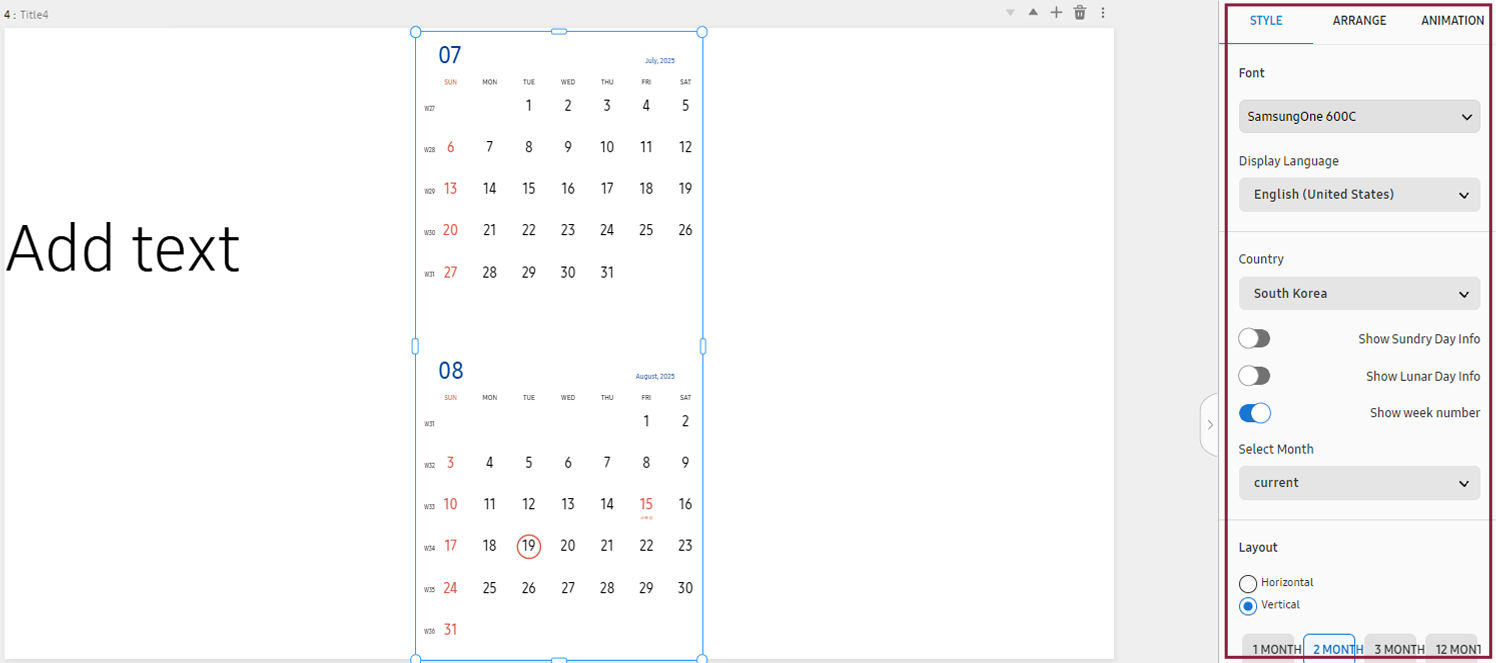
Using weather widgets
Using a weather widget, display current weather information and forecasts for a specified area, in real time, on the screen.
-
From the main panel on the canvas page, click Widgets > Weather and then select the widget you want.
-
The selected weather widget appears on the canvas.
-
In the element properties panel on the right, select a weather location, language, time format, and temperature unit.
-
Adjust the font color, alignment, animation effects, and other element properties to customize the clock widget styles.
Editing a weather widget using the properties menu
Edit the styles of a weather widget added to a canvas. This can be done from the element properties panel on the right of the canvas.
 |
Background properties
Adjust properties of background elements. Click the BACKGROUND tab.
For more information about background properties, refer to the following:
Canvas properties
Adjust the properties of canvas elements. Click the Canvas tab.
For more information about canvas properties, refer to the following:
Style properties
Adjust style properties. Click the Style tab.
|
Item |
Description |
|---|---|
|
Location |
Set the weather location. This can be done by selecting Auto or setting a City, Zip/Postal Code. |
|
Display Language |
Set the weather widget language. |
|
Date & Time Format |
Set the date/time display format. |
|
Background |
Set the weather widget background color. |
|
Unit |
Set the temperature unit to Celsius or Fahrenheit. |
|
Refresh Interval |
Set the refresh frequency. |
|
Basic information |
Set the items to be displayed in the weather widget:
|
|
Text |
Set the font type, color, and size for weather widget display. |
|
Shadow |
Add a shadow to the weather widget background. |
|
Border |
Set the outline thickness and corner radius for the weather widget background. |
Alignment properties
Configure settings to align or rearrange image or text elements. Click the Arrange tab.
For more information about alignment properties, refer to the following:
Animation properties
Insert specific animation effects into elements, or adjust the settings of elements
that have animation effects. Click the Animation tab.
For more information about animation properties, refer to the following:
Using clock widgets
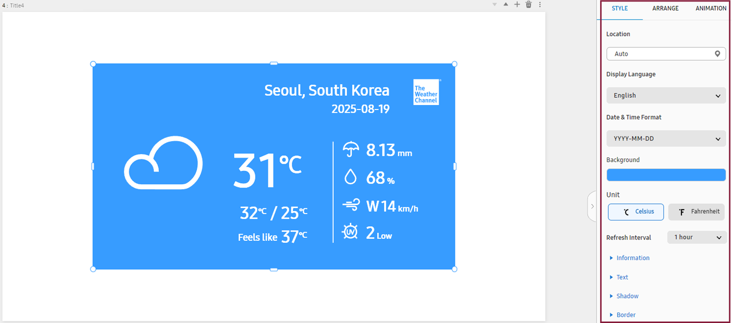
Using a clock widget, display the current time, as follows:
-
From the main panel on the canvas page, click Widgets > Clock and then select the widget you want.
-
The selected clock widget appears on the canvas.
-
To display a clock for a specific time zone, set the time zone and date/time format from the element properties panel on the right.
-
To use daylight saving time, toggle on the option “Daylight Saving Time.”
-
Adjust the font color, alignment, animation effects, and other element properties to customize the clock widget styles.
Editing a clock widget using the properties menu
Edit the styles of a clock widget added to a canvas. This can be done from the element properties panel on the right of the canvas.
 |
Background properties
Adjust properties of background elements. Click the BACKGROUND tab.
For more information about background properties, refer to the following:
Canvas properties
Adjust the properties of canvas elements. Click the Canvas tab.
For more information about canvas properties, refer to the following:
Style properties
Adjust style properties. Click the Style tab.
|
Item |
Description |
|---|---|
|
Time Zone |
Set the standard time zone for the widget to display. Set this value according to your region, as the standard time zone used differs by region. |
|
Display Language |
Set the time widget language. |
|
Date & Time Format |
Set the date/time display format. |
|
Daylight Saving Time |
To use daylight saving time, toggle the daylight saving time option on. |
|
Text |
Set the font type, color, and size for the clock widget. |
|
Shadow |
Add a shadow to the clock widget background. |
|
Border |
Set the outline thickness and corner radius for the clock widget background. |
Alignment properties
Configure settings to align or rearrange image or text elements. Click the Arrange tab.
For more information about alignment properties, refer to the following:
Animation properties
Insert specific animation effects into elements, or adjust the settings of elements
that have animation effects. Click the Animation tab.
For more information about animation properties, refer to the following:
Using animation effect widgets
Add various motions to images, to attract attention and express content more dynamically.
-
From the main panel on the canvas page, click Widgets > Animation and then select the widget you want.
-
 (Rotate): Selected images spin and move along a curve or straight line. Each spinning image
is highlighted at the specified position.
(Rotate): Selected images spin and move along a curve or straight line. Each spinning image
is highlighted at the specified position. -
 (Expanded): Selected images, aligned to the bottom, become larger and move to the center of
the widget, one after another.
(Expanded): Selected images, aligned to the bottom, become larger and move to the center of
the widget, one after another. -
 (Wave): Selected images, placed at the bottom, move up and down one after another, creating
a wave effect.
(Wave): Selected images, placed at the bottom, move up and down one after another, creating
a wave effect.
-
-
The selected animation effect widget appears on the canvas.
-
In the properties panel on the right, click the Style tab and then click
 under the image.
 -
Select the image you want and then click OK.
You can remove the background from the image, if necessary. For details on how to remove the background from an image, refer to the following:
-
Adjust the playback time, background color, animation effects, and other element properties to customize the widget styles.
Editing an animation effect widget using the properties menu
Edit the styles of an animation effect widget added to a canvas. This can be done from the element properties panel on the right of the canvas.
 |
Background properties
Adjust properties of background elements. Click the BACKGROUND tab.
For more information about background properties, refer to the following:
Canvas properties
Adjust the properties of canvas elements. Click the Canvas tab.
For more information about canvas properties, refer to the following:
Style properties
Adjust style properties. Click the Style tab.
|
Item |
Description |
|---|---|
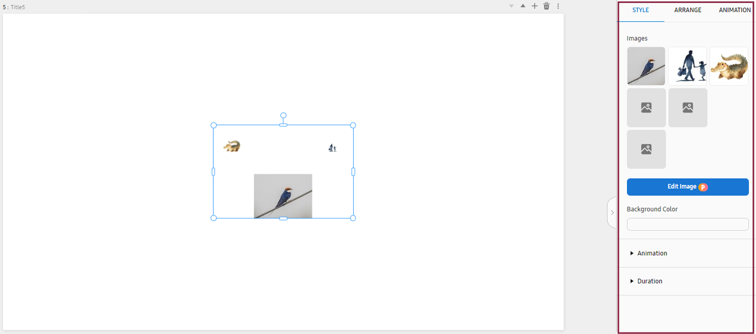
|
Image |
Select the image(s) to which you want to add an animation effect widget. A maximum of six images can be selected. To remove the background image, click Edit Image. |
|
Background Color |
Set the widget’s background color. |
|
Animation |
|
|
Duration |
Set the total playback time and the playback time when highlighting images. |
Alignment properties
Configure settings to align or rearrange image or text elements. Click the Arrange tab.
For more information about alignment properties, refer to the following:
Animation properties
Insert specific animation effects into elements, or adjust the settings of elements
that have animation effects. Click the Animation tab.
For more information about animation properties, refer to the following:
Using visual effects widgets
Add visual effects to content, such as flying confetti, falling rain, or falling snow.
-
From the main panel on the canvas page, click Widgets > Visual Effect and then select the widget you want.
-
 (Confetti): Add a visual effect of flying confetti.
 -
 (Snow): Add a visual effect of falling snow.
 -
 (Rain): Add a visual effect of falling rain.
 -
 (Smoke): Add a visual effect of smoke rising.
 -
 (Bubble): Add a visual effect of water droplets floating upward.
 -
 (Light): Add a visual effect of light spreading.
 -
 (Coloring): Add a visual effect of specified colors moving.
-
-
The selected visual effect widget appears on the canvas.
-
In the element properties panel on the right, click the Style tab and then set the visual effect speed, size, and quantity. Adjust the element properties to customize the widget styles.
Editing a visual effect widget using the properties menu
Edit the styles of a visual effect widget added to a canvas. This can be done from the element properties panel on the right of the canvas.
 |
Background properties
Adjust properties of background elements. Click the BACKGROUND tab.
For more information about background properties, refer to the following:
Canvas properties
Adjust the properties of canvas elements. Click the Canvas tab.
For more information about canvas properties, refer to the following:
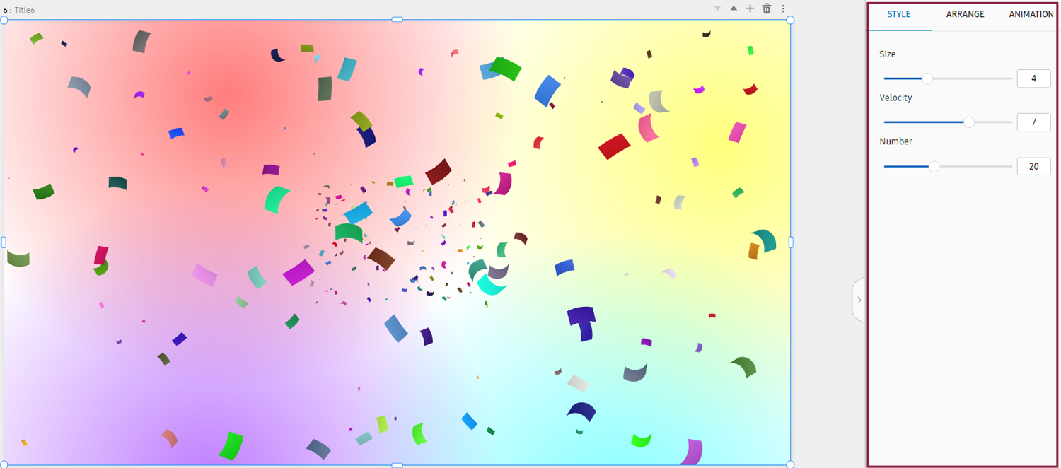
Style properties
Adjust style properties. Click the Style tab.
|
Item |
Description |
|---|---|
|
Size |
Set the size of each visual effect. |
|
Speed |
Set the speed at which each visual effect is displayed. |
|
Number |
Set the number of media that express each visual effect (e.g., e.g., snowflakes, raindrops, water droplets). |
|
Opacity |
Set the opacity. |
|
Light Color |
Set the light color. |
Alignment properties
Configure settings to align or rearrange image or text elements. Click the Arrange tab.
For more information about alignment properties, refer to the following:
Animation properties
Insert specific animation effects into elements, or adjust the settings of elements
that have animation effects. Click the Animation tab.
For more information about animation properties, refer to the following:
Creating Content Using Media Elements
Import media elements (e.g., images, videos, web content, and MS Office files) previously uploaded to workspace content items.
-
4K video cannot be used together with video of a different resolution
-
For details on how to upload media content, refer to the following:
-
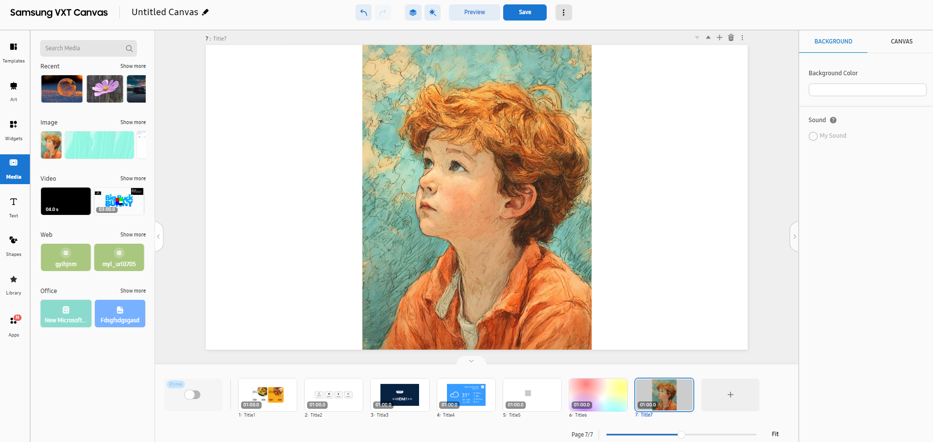
Open the main page of the Content menu.
-
From the main panel on the canvas page, select Media.
-
From the list of media elements, select the desired media element to display it on the canvas.
Media menu items
The following items are displayed when the Media menu is selected.
|
Item |
Description |
|---|---|
|
Search media |
Search with a keyword to easily find specific media content. |
|
Recent |
Displays recently used media content. |
|
Image, Video, Web, Office |
View media content by type. |
Using image elements
Use image content added to workspaces.
-
From the main panel on the canvas page, click Media > Image and then select the content item you want. To browse more image content items, click More.
-
The selected image appears on the canvas.
-
From the element properties panel on the right, fine-tune the properties to achieve the desired content.
Editing images using the properties menu
Edit an image added to a canvas. This can be done from the element properties panel on the right of the canvas.
 |
Background properties
Adjust properties of background elements. Click the BACKGROUND tab.
For more information about background properties, refer to the following:
Canvas properties
Adjust the properties of canvas elements. Click the Canvas tab.
For more information about canvas properties, refer to the following:
Style properties
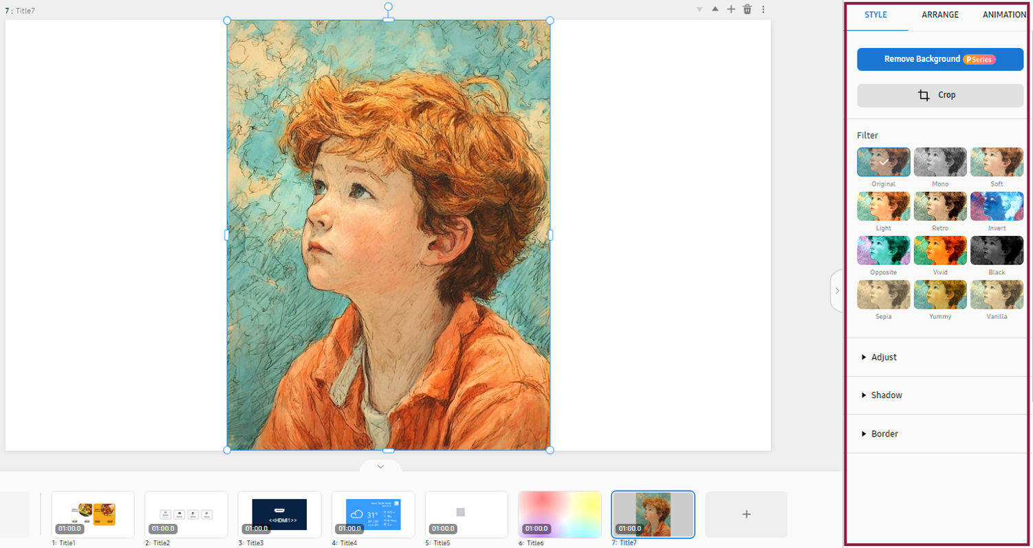
Adjust the following properties of an image element. Click the Style tab.
|
Item |
Description |
|---|---|
|
Remove Background |
Delete the image background.
|
|
Crop |
Crop an element. |
|
Filter |
Set filter effects to add to an image.
|
|
Adjust |
Configure image color settings.
|
|
Shadow |
Configure shadow settings.
|
|
Border |
Configure border settings.
|
Alignment properties
Configure settings to align or rearrange image or text elements. Click the Arrange tab.
For more information about alignment properties, refer to the following:
Animation properties
Insert specific animation effects into elements, or adjust the settings of elements
that have animation effects. Click the Animation tab.
For more information about animation properties, refer to the following:
Removing a background image
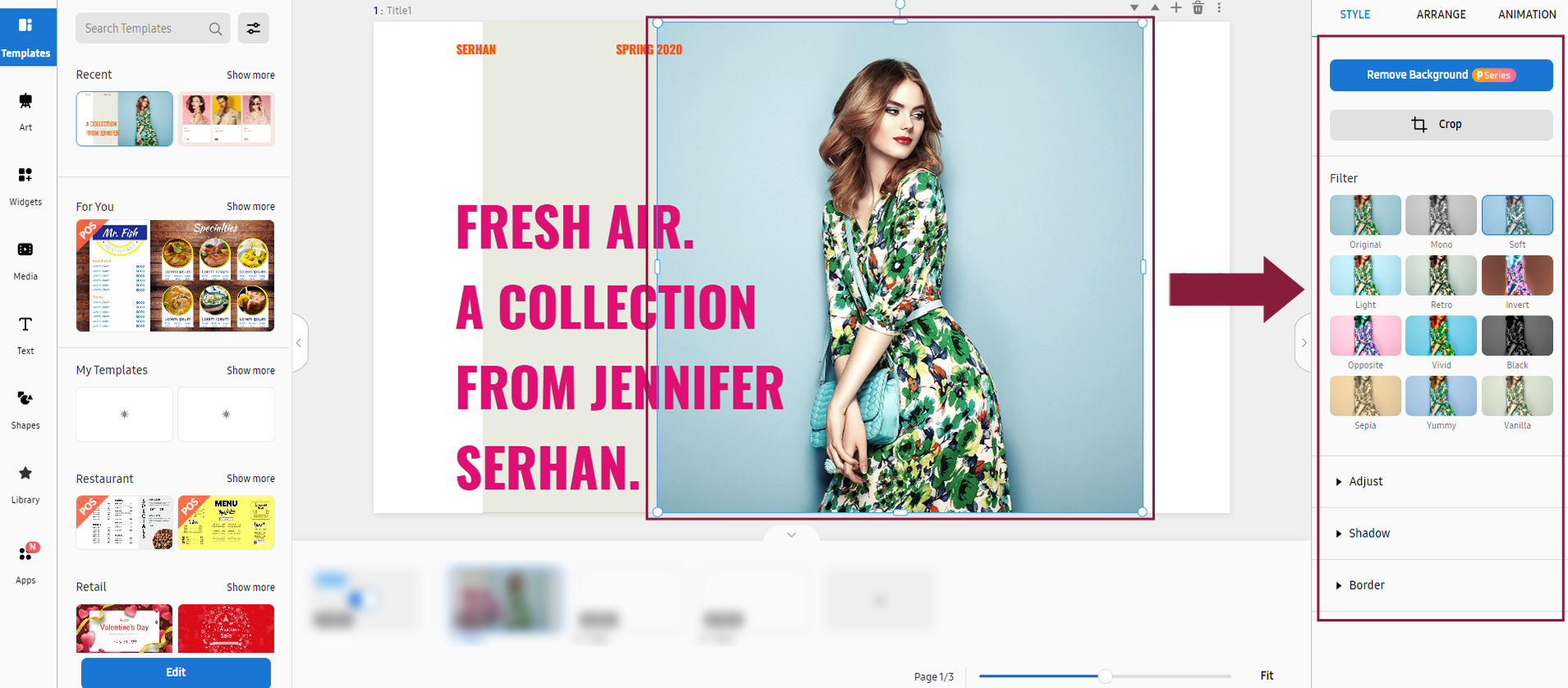
When you want to increase attention to a specific object in an image, such as a product, figure, or logo, or when you want to create visual unity and atmosphere by changing the background color, remove the background from the image.
-
This feature may not be supported, depending on the rate plan in use.
-
On the canvas, display the image element from which you want to remove the background.
-
In the element properties panel, select the Style tab and then click Remove Background.
-
Click Delete. The background is removed from the image.
-
Click Done to save the edited image.
Partially removing a background
It is possible to partially remove the background from an image.
-
On the canvas, display the image element from which you want to remove the background.
-
In the element properties panel, select the Style tab and then click Remove Background.
-
Drag with the mouse to mark the area of the background to retain, and then click Delete. Only the background outside the marked area is deleted.
-
Click Done to save the edited image.
Using video elements
Use video content added to workspaces.
-
From the main panel on the canvas page, click Media > Video and then select the content you want. To browse more video content items, click More.
-
The selected video appears on the canvas.
-
From the element properties panel on the right, fine-tune the properties to achieve the desired content.
Editing a video using the properties menu
Edit a video added to a canvas. This can be done from the element properties panel on the right of the canvas.
-
For video elements, Style and Animation properties are not supported.
 |
Background properties
Adjust properties of background elements. Click the BACKGROUND tab.
For more information about background properties, refer to the following:
Canvas properties
Adjust the properties of canvas elements. Click the Canvas tab.
For more information about canvas properties, refer to the following:
Alignment properties
Configure alignment properties to align or rearrange videos. Click the Arrange tab.
For more information about alignment properties, refer to the following:
Using web content elements
Use web content added to workspaces.
-
From the main panel on the canvas page, click Media > Web and then select the content you want. To browse more web content items, click More.
-
The selected web content appears on the canvas.
-
From the element properties panel on the right, fine-tune the properties to achieve the desired content.
Editing web content using the properties menu
Edit a web document added to a canvas. This can be done from the element properties panel on the right of the canvas.
Background properties
Adjust properties of background elements. Click the BACKGROUND tab.
For more information about background properties, refer to the following:
Canvas properties
Adjust the properties of canvas elements. Click the Canvas tab.
For more information about canvas properties, refer to the following:
Style properties
Edit web content address or refresh rate. Click the Style tab.
|
Item |
Description |
|---|---|
|
Refresh Interval |
Set the refresh cycle. |
Alignment properties
Configure settings to align or rearrange image or text elements. Click the Arrange tab.
For more information about alignment properties, refer to the following:
Animation properties
Insert specific animation effects into elements, or adjust the settings of elements
that have animation effects. Click the Animation tab.
For more information about animation properties, refer to the following:
Using MS Office elements
Use documents added to workspaces.
-
From the main panel on the canvas page, click Media > Office and then select the content you want. To browse more documents, click More.
-
The selected document appears on the canvas.
-
From the element properties panel on the right, fine-tune the properties to achieve the desired content.
Editing a document using the properties menu
Edit an added MS Office document. This can be done from the element properties panel on the right of the canvas.
-
For MS Office document elements, animation properties are not supported.
 |
Background properties
Adjust properties of background elements. Click the BACKGROUND tab.
For more information about background properties, refer to the following:
Canvas properties
Adjust the properties of canvas elements. Click the Canvas tab.
For more information about canvas properties, refer to the following:
Style properties
Adjust the properties of an MS Office document. Click the Style tab.
|
Item |
Description |
|---|---|
|
Page Invertal |
For documents containing multiple pages, it is possible to set the display time for each page. |
Alignment properties
Configure settings to align or rearrange image or text elements. Click the Arrange tab.
For more information about alignment properties, refer to the following:
Creating Content Using Text Elements
Using text elements, insert or edit texts to content, and decorate the content.
 |
-
Open the main page of the Content menu.
-
From the main panel on the canvas page, select Text.
-
From the element properties panel on the right, fine-tune the properties to achieve the desired content.
-
Edit the content or visual representation of text.
Text menu items
The following items are displayed when the Text menu is selected.
|
Item |
Description |
|---|---|
|
Add Text |
Add text that has no style specified. |
|
Recent |
Displays recently used text. |
|
Style |
Displays various styles of text. |
Editing a text widget using the properties menu
Edit a text element added to a canvas. This can be done from the element properties panel on the right of the canvas.
 |
Background properties
Adjust properties of background elements. Click the BACKGROUND tab.
For more information about background properties, refer to the following:
Canvas properties
Adjust the properties of canvas elements. Click the Canvas tab.
For more information about canvas properties, refer to the following:
Style properties
Adjust the following properties of a text element. Click the Style tab.
|
Item |
Description |
|---|---|
|
Upload Font |
Upload the font file to use. |
|
Font / Font Size |
Set the font and font size. |
|
Text Color |
Set the text color. |
|
Background |
Set the background color. |
|
Text Outline |
Configure border settings. |
|
Text Shadow |
Configure shadow settings. |
|
Align Text |
Set the alignment.
|
|
Text Style |
Set the text style.
|
|
Text spacing |
Set the line spacing and character spacing.
|
|
Auto Fit |
Automatically adjust text alignment, style and spacing. |
|
Animation |
Set animation effects.
|
|
Shadow |
Configure shadow settings.
|
|
Border |
Configure border settings.
|
Alignment properties
Configure settings to align or rearrange image or text elements. Click the Arrange tab.
For more information about alignment properties, refer to the following:
Animation properties
Insert specific animation effects into elements, or adjust the settings of elements
that have animation effects. Click the Animation tab.
For more information about animation properties, refer to the following:
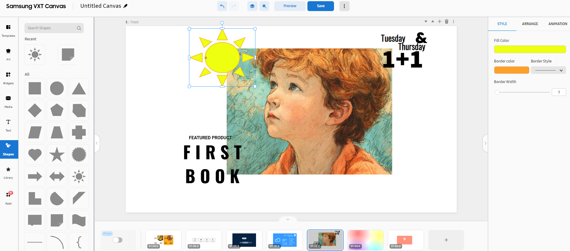
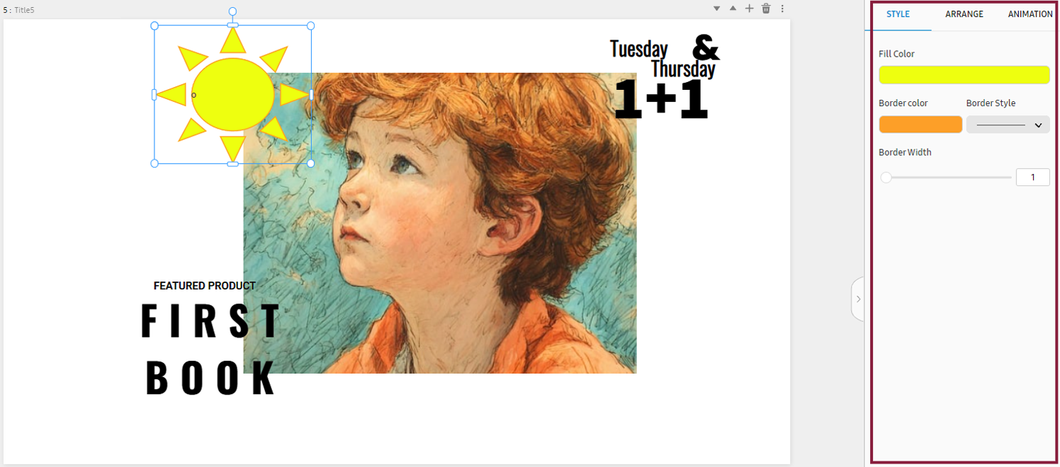
Creating Content Using Geometric Shape Elements
Add various line and geometric shape elements (e.g., circles, triangles, squares, and/or polygons).
 |
-
Open the main page of the Content menu with a template added.
-
From the main panel on the canvas page, select Shapes.
-
From the list of geometric shape elements, select the geometric shape you want. The selected geometric shape appears on the canvas.
-
Edit the size, color, and other attributes of the shape. From the element properties panel on the right, adjust the properties to achieve the desired content.
Shapes menu items
The following items are displayed when the Shapes menu is selected.
|
Item |
Description |
|---|---|
|
Search shapes |
Search with a keyword to easily find specific shapes. |
|
Recent |
Displays recently used shapes. |
|
Allocation |
Displays all available shapes. |
Editing a geometric shape widget using the properties menu
Edit a geometric shape added to a canvas. This can be done from the element properties panel on the right of the canvas.
 |
Background properties
Adjust properties of background elements. Click the BACKGROUND tab.
For more information about background properties, refer to the following:
Canvas properties
Adjust the properties of canvas elements. Click the Canvas tab.
For more information about canvas properties, refer to the following:
Style properties
Adjust the following properties of a geometric shape element. Click the Style tab.
|
Item |
Description |
|---|---|
|
Fill Color |
Set the fill color.
|
|
Border |
Set the border color. |
|
Bolder Style |
Set the border style. |
|
Bolder Width |
Set the border width. |
Alignment properties
Configure settings to align or rearrange image, shape, and/or text elements. Click
the Arrange tab.
For more information about alignment properties, refer to the following:
Animation properties
Insert specific animation effects into elements, or adjust the settings of elements
that have animation effects. Click the Animation tab.
For more information about animation properties, refer to the following:
Creating Content Using Library Elements
Upload data in your local storage to VXT CMS for use as elements, instead of using templates or designs available on the canvas page. Alternatively, use free images available on Pixabay as elements for creating content.
Library menu items
The following items are displayed when the Library menu is selected.
|
Item |
Description |
|---|---|
|
Recent |
View recently used elements. |
|
Pixabay |
Browse free images available on Pixabay. |
|
Image |
View locally stored images. |
|
Video |
View locally stored videos. |
|
Sound |
View locally stored sounds. |
Adding Pixabay images
Use free images available on Pixabay as elements for creating content.
-
From the main panel on the canvas page, click Library > Pixabay and then select the element you want. To browse more images, click More.
If the intended image is not found, search for more images by selecting More and entering a search term in the search box.
-
The selected Pixabay image appears on the canvas.
-
From the element properties panel on the right, fine-tune the properties to achieve the desired content. For more information about element properties, refer to the following:
Adding locally stored images
Use images, uploaded to VXT Canvas, as elements for creating content.
-
From the main panel on the canvas page, click Library > Image and then select the element you want. To browse more images, click More.
-
The selected image appears on the canvas.
-
From the element properties panel on the right, fine-tune the properties to achieve the desired content.
Adding videos
Use videos, uploaded to VXT Canvas, as elements for creating content.
-
From the main panel on the canvas page, click Library > Video and then select the element you want. To browse more videos, click More.
-
The selected video appears on the canvas.
-
From the element properties panel on the right, fine-tune the properties to achieve the desired content.
Adding sounds
Insert sounds into content to add life to the content. Use sounds, uploaded to VXT Canvas, as elements for creating content.
-
From the main panel on the canvas page, click Library > Sound and then select the element you want. To browse more sounds, click More.
-
Drag and drop a sound from the left panel into the content. The sound is inserted into the content.
Expanding Content Using Apps
To use elements that are not available in VXT Canvas, you can add those elements using an app. Install the app you want, as follows:
-
Open the Canvas page.
-
From the main panel of the canvas page, click Apps.
-
Select the intended app from the list of apps for each app category, and then click Install to install the app.
-
The installed app can be found at the bottom of the main panel of the canvas page. Use the installed app to add elements.
Apps menu items
The following items are displayed when the Apps menu is selected.
|
Item |
Description |
|---|---|
|
Background Color |
Set the background color. |
|
Size |
Set the background size and orientation. |
|
Background Sound |
Set the background music. |
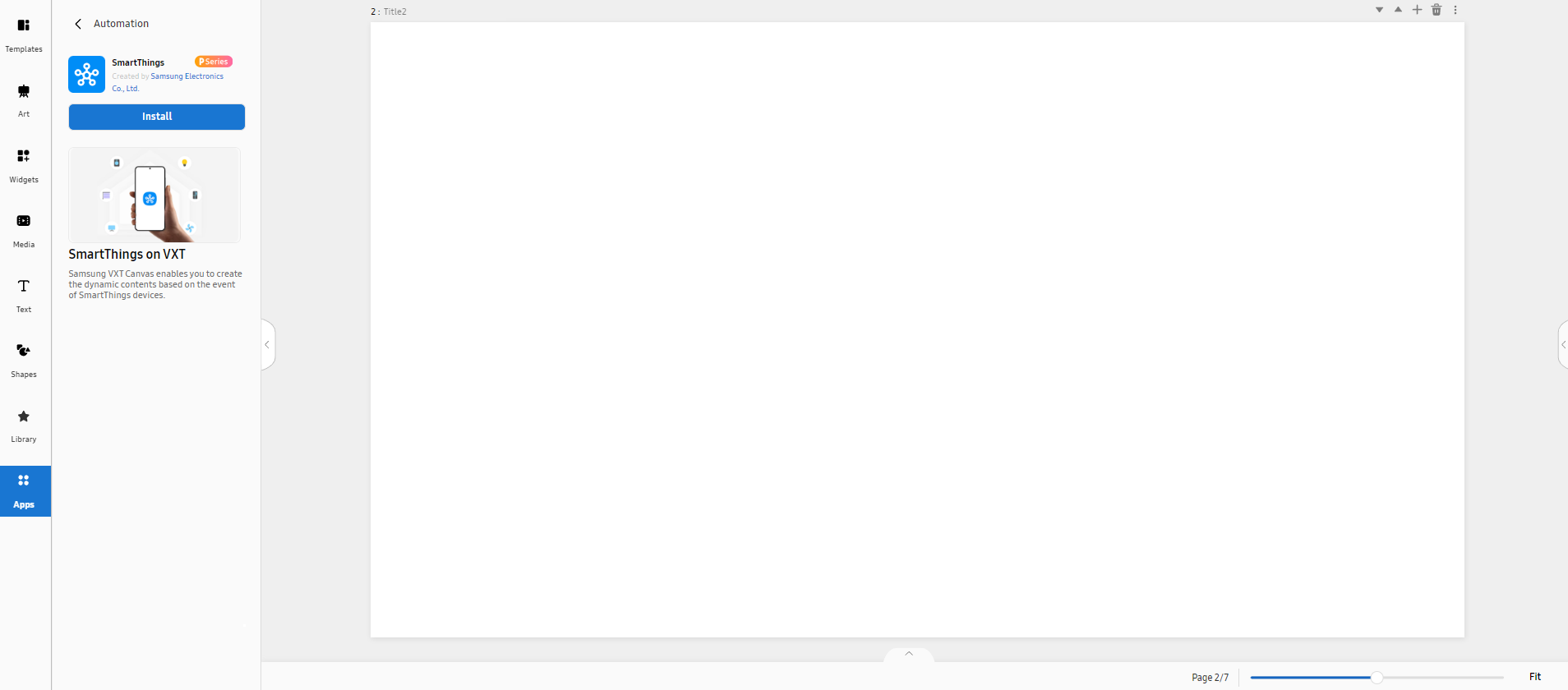
Using the SmartThings App
Using the SmartThings app, create dynamic content based on events on your SmartThings
devices.
Search for Apps from SmartThings, and then select Install to install the app.
 |
|
SmartThings devices (category) |
Supported functions (capabilities) |
|---|---|
|
Button |
alarm: Alarm and flashing light status |
|
ContactSensor |
|
|
Door |
|
|
GenericSensor |
|
|
LightSensor |
|
|
MotionSensor |
|
|
MultifunctionalSensor |
|
|
PresenceSensor |
|
|
Siren |
|
|
Switch |
|
|
TempHumiditySensor |
|
|
TempSensor |
|
|
RainSensor |
|
|
Range |
|
|
Safe |
|
|
Thermostat |
|
|
Tracker |
|
|
VisionSensor |
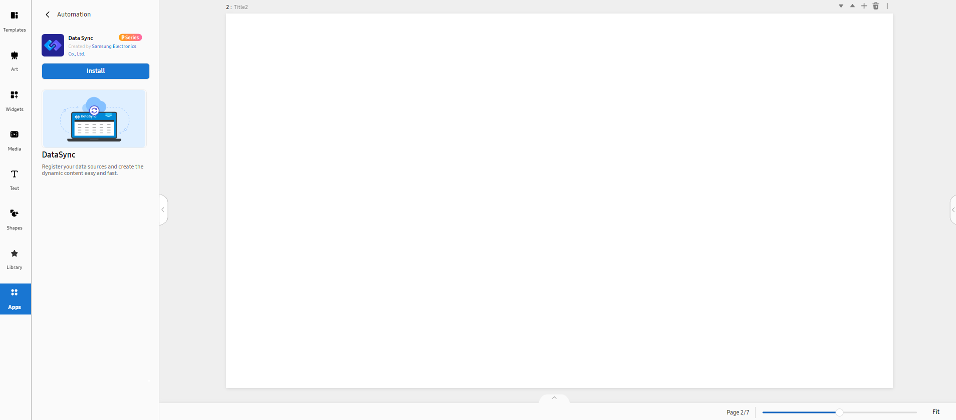
Using the Data Sync App
Register data sources to create dynamic content easily and quickly.
Search for Apps from Data Sync, and then click Install to install the app.
 |
Using the Gen AI App
Create content, using the Gen AI app.
-
Search for Apps from Gen AI, and then click Install to install the app.
-
When installation is complete, enter a description of the content you want to create in the Message field.
-
Set the aspect ratio, size, and other attributes, and then click Generate.
-
Select the desired content from among the generated content items and load it onto your page.
Using Various Apps
In addition to the simple apps introduced on this page, you can install and use a
wider variety of apps on Canvas.
For more information about available apps and how to use them, refer to the following: